Prompt Health Design System
UI/UX System Design
Created a new design system library for a health solution company, established a set of guidelines, components, and styles to ensure consistency and efficiency in the design and development process across multiple digital platforms.
Deliverables: Component library & documentation
Website: visit website
︎︎︎ Type: Freelance Indivudual Project
︎︎︎ Role: UI/UX Design + Documenting
Deliverables: Component library & documentation
Website: visit website
︎︎︎ Type: Freelance Indivudual Project
︎︎︎ Role: UI/UX Design + Documenting
︎︎︎ Tool: Figma + Confluence
︎︎︎ Date
: Dec 2020

Overview
A design system comprises reusable components, following well-defined standards, to construct a wide range of applications. It addresses the requirements for scalability, efficiency, and consistency in design. Below are some components I developed for the PromptHealth design system.
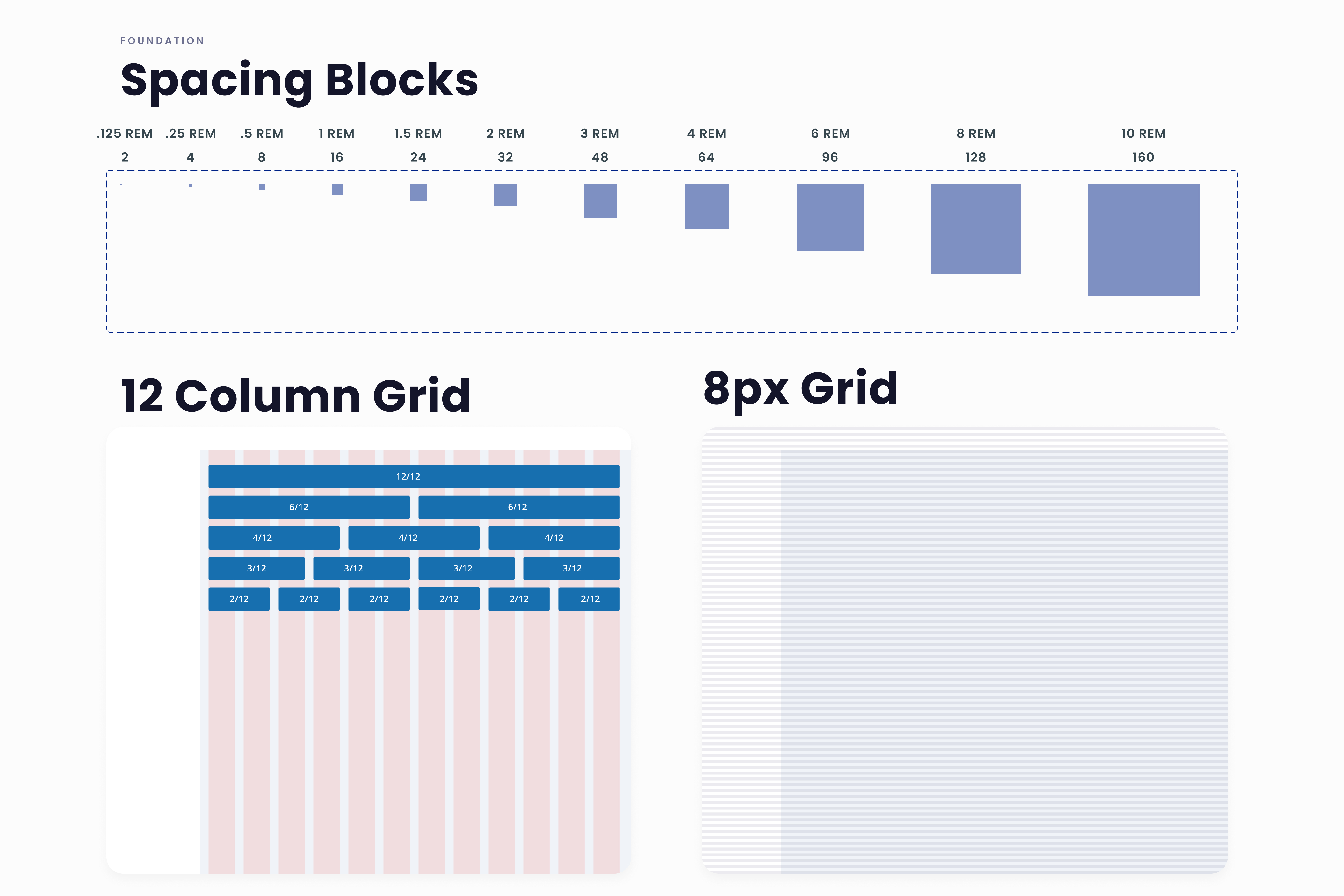
Spacing and grid system
The foundation of a design system is spacing and grid system. For this project I went with an 8pt grid system that consists of a 12 column grid and an 8px baseline grid, enhancing responsiveness for all major screen sizes and preventing anti-aliasing issues.![]()
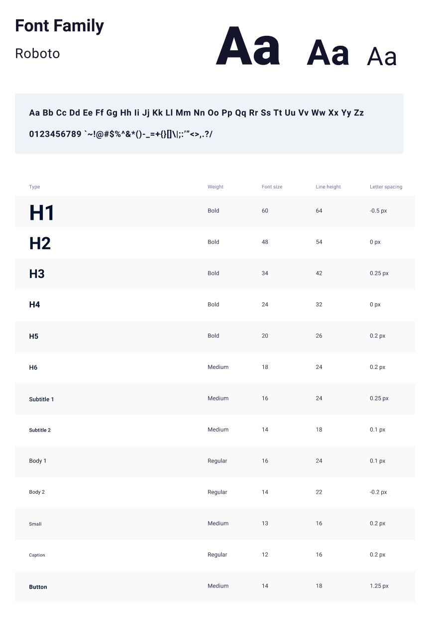
Typography
For the web, I chose a clean and versatile font that works well as both heading and body text due to its various weight variations. On mobile devices, I used San Francisco for iOS and Roboto for Android.
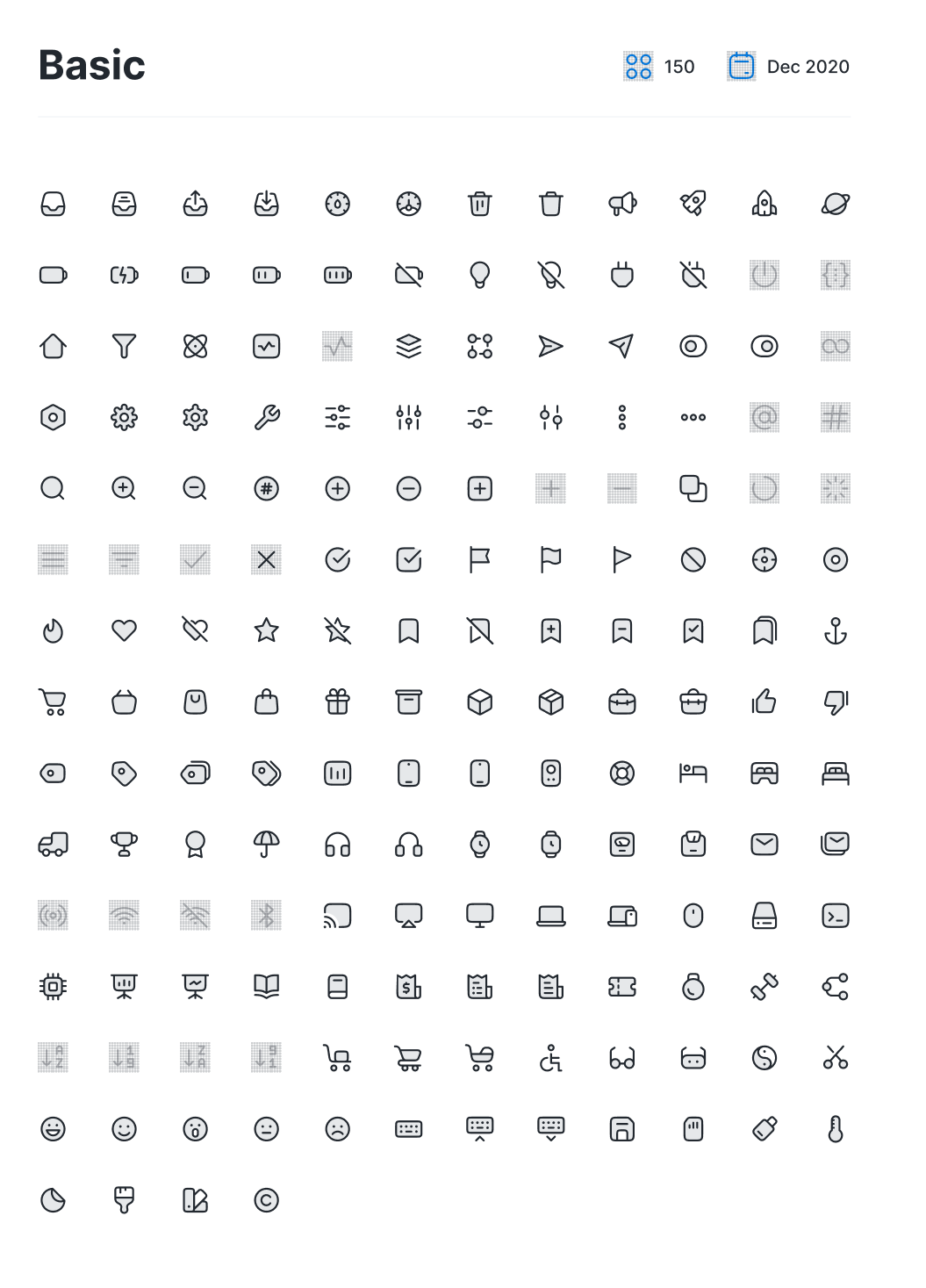
Iconography
In PromptHealth, icons serve as visual aids to assist users in completing tasks. I chose a simple icon set to reduce cognitive load, as detailed icons can be overwhelming. The focus on simplicity ensures users can easily grasp the concepts represented by the icons, even on smaller screens.
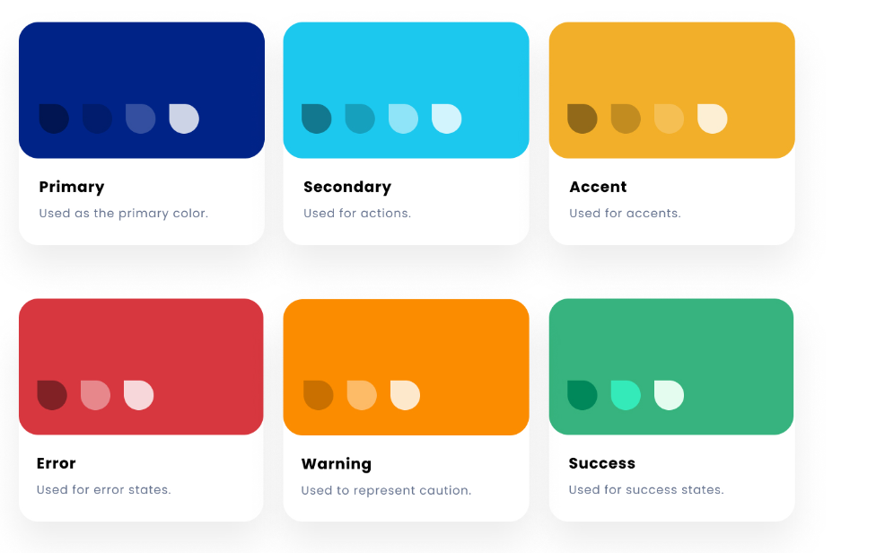
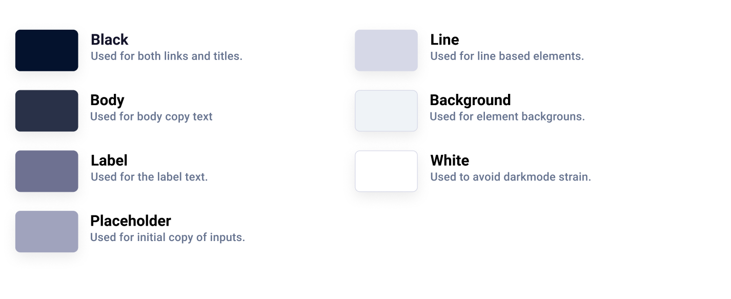
Color palette
Although I value an aesthetically pleasing use of color, I place a higher value on clear communication. Colors are chosen purposefully to convey information, with specific roles assigned to each. This ensures easy modification and consistency across touchpoints.
![]()
![]()
Buttons
Buttons usually need to be designed for various states, such as active, hover, focus, and disabled. For PromptHealth, I opted for three of these states, along with four different button types: Primary, Secondary, Outline, and Link. Here are a few examples of buttons in different states.

Form fields
Another important component I built for PromptHealth is the form fields. Similar to buttons, form fields must accommodate various states. Accessibility is a key consideration in their design, ensuring the field title remains visible when selected and using indicators beyond color for errors. Additionally, essential components like dropdowns, radios, checkboxes, toggles, and more are incorporated.

Reflection
Design Systems are like a living organism in that they complex and ever evolving. What I showed here is just a section of what goes into a complete system. Creating a design system has been an enlightening experience for me. It allowed me to understand the significance of consistency and standardization in design, leading to a more cohesive and user-friendly product. A well-structured design system not only enhances efficiency and scalability but also fosters better collaboration among team members.
